Voter Satisfaction Efficiency: Many, many results
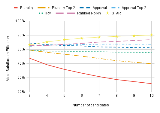
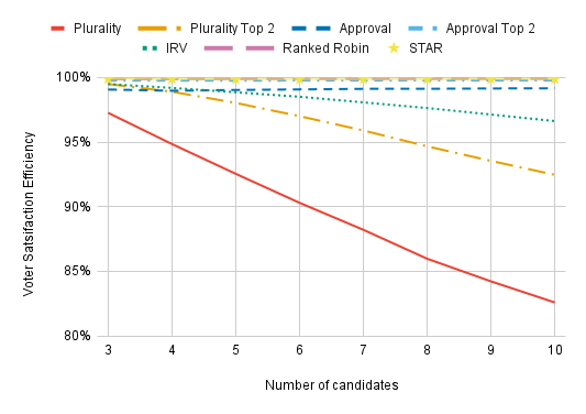
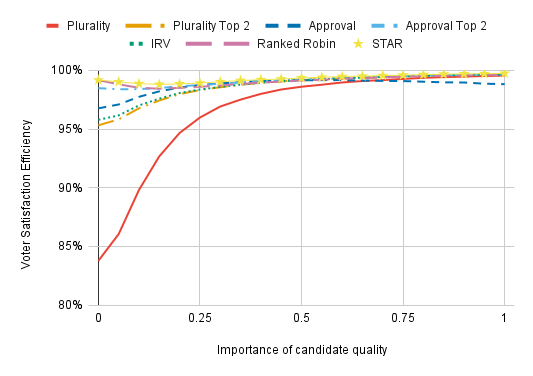
Voter Satisfaction Efficiency (VSE) tells you how happy voters are with the outcomes produced by a voting method. Here’s a chart:

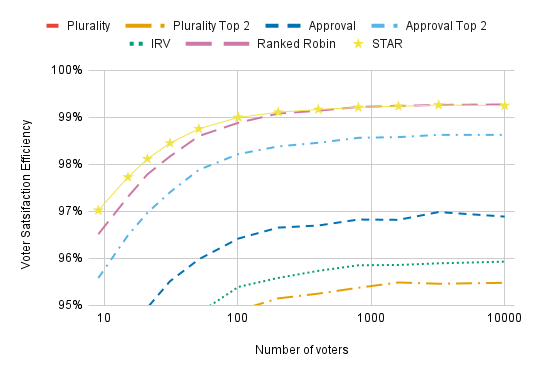
Voters tend to be the most satisfied with the winners under STAR and Ranked Robin and the least satisfied under Plurality, and the differences between voting methods become more pronounced when more candidates are competing.
What is VSE?
As a starting point, suppose each voter has a number representing how good they think it would be for any given candidate to win. Higher is better, and the difference between 4 and 6 is four times as large as the difference between 7.5 and 8. We call these numbers the voter’s utilities for the candidates. Voters cast ballots in accordance with these utilities; with a ranked ballot, for instance, they’d rank their highest-utility candidate #1, their second-highest utility candidate #2, etc.
We can evaluate voting methods by asking: If I’m a random voter, how happy will I be, on average, with the winners elected under each voting method? We answer this question mathematically by summing the utilities given to the winning candidate by all voters, and we can sum these results over thousands of elections to tell us how well a voting method performs on average.
There’s one last step to making these numbers meaningful: We normalize them by saying that a voting method that magically elects the highest average utility candidate every time has a Voter Satisfaction Efficiency (VSE) of 1, and a voting method that elects candidates completely at random has a VSE of 0.
However, determining VSE with real voters in actual elections would be a hopeless endeavor. Election results don’t tell us how voters feel about the candidates; the results of a Plurality or Ranked Choice Voting election say nothing about how much better a voter thinks their first choice is than their second choice, and the possibility of strategic voting means we don’t even know who a voter’s sincere first choice was. Instead, we rely on computer simulations. We create a simulated electorate in which all voters have their own randomly-generated utilities for all the candidates, the voters vote in accordance with their preferences, and we determine the results for thousands (usually 100,000) of simulated elections for every voting method that interests us.
I’m talking about VSE like it’s a property of a voting method, but it’s actually determined by a lot of factors:
- The voting method, which determines what the ballots look like and who wins
- The voter model, which determines the distribution of voter preferences over candidates
- The strategies used by voters. Mathematically, a strategy is a function that takes a voter’s preferences and (possibly) some polling information and produces a ballot
- The number of candidates
- The number of voters, which only has a minor effect on VSE.
- The polling noise; strategic voting is more effective with low polling noise, which typically leads to higher VSE
We will consider various possibilities for all of these factors. In general, I’ll err on the side of including results for ridiculous possibilities instead of omitting them, and some of the models we consider are pretty absurd.
Voting methods under consideration
We consider the following voting methods:
- Plurality: Voters vote for only one candidate. Whoever receives the most votes wins.
- Plurality Top 2: In the first round, voters vote for only one candidate. The two candidates with the most votes advance to a runoff in which each voter votes for a single candidate, and the finalist with the most votes in the runoff wins.
- Approval: Voters vote for any number of candidates. Whoever receives the most votes wins.
- Approval Top 2: Same as Plurality Top 2, except that voters can vote for any number of candidates in the first round.
- Instant Runoff Voting (IRV, also known as single-winner Ranked Choice Voting): Each ballot is a ranking of some or all of the candidates. At the beginning of tabulation, each ballot is counted as one vote for its highest-ranked candidate. In each round, the candidate with the fewest votes is eliminated and their votes are transferred to the highest remaining choices on their supporters’ ballots. The last candidate remaining wins.
- STAR Voting: Voters score the candidates from 0 to 5. The two candidates with the highest total scores are finalists, and whichever finalist receives a higher score than the other on more ballots wins.
- Ranked Robin: Voters rank the candidates. (Unlike IRV, Ranked Robin allows voters to rank the same candidate equally.) A candidate wins a one-on-one matchup against another candidate if they are ranked higher on more ballots. The candidate who wins the most one-on-one matchups is elected. If there is a tie, use Borda Count (ignoring candidates other than those who are tied) as the tiebreaker. Ranked Robin is guaranteed to elect a candidate who would beat everyone else head-to-head if there is one, so it is a Condorcet method. All Condorcet methods have roughly the same VSE.
(The descriptions of the voting methods other than Ranked Robin were taken from my recent paper.)
Why should we use VSE to evaluate voting methods?
VSE covers a wide range of pathologies that can lead to a voting method selecting the wrong winner. Worried about Nader-esque non-viable “spoiler” candidates? VSE captures that. Worried about vote-splitting under Plurality or Approval Voting? VSE captures that, and the extent to which Approval Voting protects against vote-splitting. Worried about the center squeeze? VSE captures that. Worried that the Condorcet winner is a bland fence-sitter who nobody really likes? VSE captures that. Worried a voting method will deliver widely unpopular outcomes if voters are strategic? When we model strategic voting, VSE captures that. Worried that there’s a hard-to-describe set of preferences in which a lot of voting methods fail but nobody has thought about? VSE captures that too. And some of these problems are much more common or more severe than others; VSE naturally weights each problem by the frequency at which it happens and by the severity of the problem, as determined by the voters themselves.
Because VSE accounts for such a wide range of problems and does so quantitatively and objectively, it’s a much better way to assess the quality of the winners produced by different voting methods than looking at possible failure modes one by one and seeing how vulnerable each voting method is to each of them. The latter approach is still useful for understanding voting methods — VSE doesn’t tell you why a voting method scores as well as it does — but if you want to evaluate the overall quality of a voting method for selecting good winners, VSE is the way to go.
Note, however, that VSE only accounts for problems in a voting method insofar as they cause the wrong winners to get elected. It doesn’t account for how difficult voting methods are to tabulate, the incentives they give to candidates, whether they promote the growth of third parties when their chosen candidates lose, etc. And these other considerations can be very important; I think that how a voting method affects political culture is more important than how reliable a voting method is at choosing the right winners. That said, if a voting method has low VSE there has to be some reason for it, and such a reason may spell trouble in areas that VSE doesn’t measure directly.
VSE is not a new idea. The use of computer simulations for this metric goes back to Samuel Merrill’s 1984 paper in which it was called “social utility efficiency”. Jameson Quinn has studied it more recently, releasing his first VSE simulations in approximately 2017 and giving it the name “Voter Satisfaction Efficiency”. I got involved a few years ago, co-authoring a paper with Jameson that included a section on VSE. This blog post builds on this paper by providing far more results and incorporating improvements to some strategies. (One technical change that yields slightly higher numbers than in our paper: I changed the definition of VSE to put the averages inside the numerator and denominator of VSE, instead of calculating VSE for every individual election and then averaging.)
Code availability
The source code is available here.
Effects of different voter models
Let’s look at VSE numbers under some different voter models. We’ll start with the simplest: Impartial Culture.
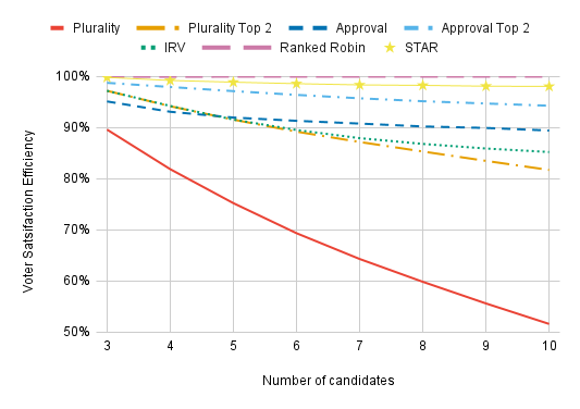
Under Impartial Culture, all utilities are uncorrelated. (More precisely, they’re i.i.d. with a Gaussian distribution. Don’t worry if you don’t know what this means.) This is an incredibly unrealistic model since it means that all candidates have nearly equal support; in a Plurality contest with 5 candidates, it’s uncommon for any candidate to get more than 23% or less than 17% of the vote. Approval does the best with only three candidates. With 5 or more candidates, STAR does the best, followed by Ranked Robin and then Approval Top 2. Plurality and Plurality Top 2 do the worst, and they perform worse the more candidates are in the race. IRV does the same as Plurality Top 2 with three candidates since these methods elect the same winners in this case, but IRV suffers far less for having additional candidates in the race.
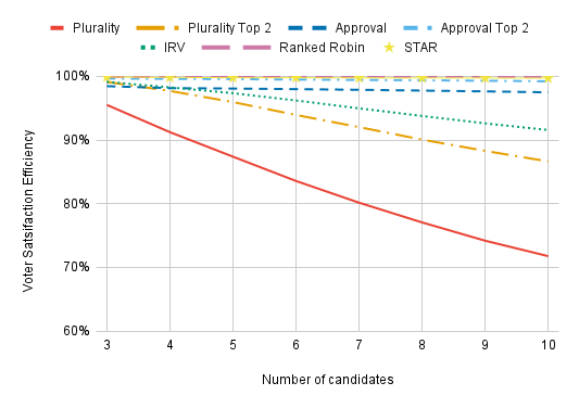
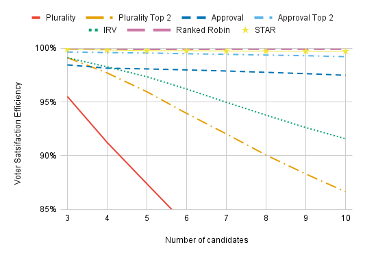
For greater realism, we can consider a spatial model. In a spatial model, voters and candidates are distributed in some abstract “issue-space”; the closer a candidate is to a voter in “issue-space”, the higher the voter’s utility for that candidate. Voters and candidates are distributed in “issue-space” according to a Gaussian distribution.
In the one-dimensional model, we can most naturally think of the dimension as corresponding to the left-right political axis. With higher-dimensional models, we might imagine additional dimensions as corresponding to views on foreign policy (hawk vs. dove), a candidate’s cultural presentation (populist vs. elitist), etc. For the two-dimensional chart, one might also imagine the diamond-shaped charts beloved by libertarians.
Plurality is such an outlier that we often need to zoom in:
Going up to three dimensions doesn’t change a great deal, though Plurality, Plurality Top 2, and IRV all have an easier time when there are more dimensions.
In the spatial models above, Ranked Robin always has a VSE of over 99.8%. The reason is that these models are too symmetrical to present a challenge to a Condorcet method. With a large number of voters, there will always be about equally as many voters a certain distance to the left of the center of public opinion as the same distance to the right of public opinion, and similarly in all other dimension. The means that the candidate closest to the center of public opinion will always be both the candidate who maximizes social utility and the Condorcet winner — and Ranked Robin always elects this Condorcet winner.
To yield more unusual elections in which there is a Condorcet cycle or the Condorcet winner isn’t the candidate who maximizes social utility, we consider a clustered spatial model. In a clustered spatial model, voters form clusters, so it yields more diverse elections than a basic spatial model. In the spatial models considered above, the center of public opinion always has the highest concentration of voters — but this isn’t necessarily the case in a clustered spatial model.

Ranked Robin and STAR continue to do the best, but the additional challenges of the clustered spatial model mean that no method gets 100% VSE. We’ll continue using the clustered spatial model for most of our charts, and the chart at the top of this article is the same as the chart above (not zoomed in). This model was developed by Jameson Quinn and there’s a lot more to it than I’ve described here. A more complete (and more technical) description of it can be found in my article with Jameson.
A final note about spatial models: They can also capture traits we usually think of as being discrete, such as race and ethnicity. We can imagine placing Black candidates at 1 in a certain dimension and other candidates at 0 in this dimension, and similarly for being Latine or Asian-American, etc. In the US context, White candidates would be at the origin under this model. This also allows for candidates such as Kamala Harris being both Black and Asian-American, etc. This modeling of race (and ethnicity) is different for voters and candidates since where voters fall on such dimensions isn’t determined by their own race, but rather by how they view people of different races.
Candidate Dispersion
All of these spatial models have used a citizen voter model in which candidates are drawn from the same distribution as voters. But this is arguably unrealistic; espousing extremely unpopular opinions makes a candidate less likely to be elected, so ordinary citizens are more likely to hold radial views than politicians. For example, about 15% of Americans support abolishing the police, but such an extreme position is virtually unheard of among politicians.
We can account for such a difference between voters and politicians in our voter model by using a spatial model in which candidates are more tightly clustered around the center of public opinion than voters. (We’ll use a 2-D model.) We call the spread (mathematically, the standard deviation) in the positions of candidates the dispersion.
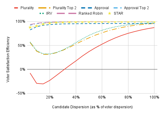
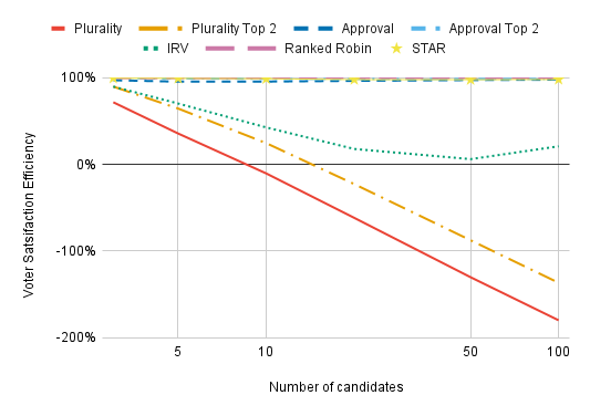
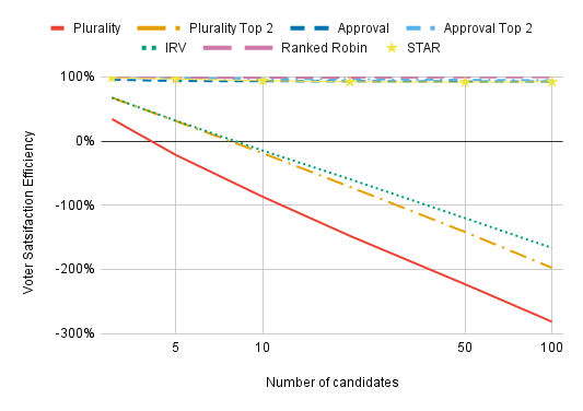
Note the scale of the y-axis. With low candidate dispersion, Plurality, Plurality Top 2, and IRV are awful. We can get more dramatic results by having far more candidates:
With low enough dispersion and enough candidates, Plurality, Plurality Top 2, and IRV all perform drastically worse than electing candidates completely at random. This is because, with low dispersion, the most extreme candidates will have the most first-choice support. A candidate who has a rival both to her left and to her right will lose voters to both of her rivals, leaving just a sliver of voters whose preference lie in between her rivals who select her as a first choice. It’s only the candidates who are furthest from the center of the electorate in a some direction who won’t lose out on first-choice support due to being “sandwiched” in this way, so Plurality, Plurality Top 2, and IRV will always elect one of these extremists. By contrast, electing people at random can easily yield a broadly acceptable winner by chance.
Is very low candidate dispersion with these voting methods at all realistic? No — but the reason it’s unrealistic is also cause for concern. Under Plurality, Plurality Top 2, and IRV, candidates are the least likely to win with low candidate dispersion if they’re at the center of public opinion, so we should expect them to purposefully avoid the center of public opinion. This is highly problematic in its own right, and it increases candidate dispersion. For more, see this paper by Robbie Robinette, who convinced me to consider candidate dispersion.

A more relevant question may be how the more reasonable methods fare with low candidate dispersion. Here we see that Ranked Robin and Approval Top 2 significantly outperform STAR with very low candidate dispersion. My best guess is that this occurs because too many voters give both finalists the same score under STAR, such that its automatic runoff is less effective than the separate runoff election of Approval Top 2. Insofar as this is correct, STAR’s lackluster numbers are more likely the result of my choosing a poor strategy function for such voter models than a fault with STAR itself, but I’ll admit that I’m uncertain exactly what is going on here.
(Approval has a lower VSE than IRV on the far right of this chart because we’re using a strategy that’s optimized for lower dispersion. More on this later.)
While low dispersion can greatly reduce the VSE of many voting methods due to them electing candidates who are far from the center of public opinion as compared to other candidates, low dispersion also means that elections are lower-stakes in a way that VSE does not capture. When the candidate dispersion is sufficiently low, every voting method will always elect candidates who are reasonably close to the center of public opinion as compared to voters because every candidate is close to the center of pubic opinion — by the definition of low candidate dispersion.
What values for dispersion best reflect real-world elections? There has been some empirical research, but it doesn’t yield a clean apples-to-apples comparison with our model, in part because the empirical research is always broken down across multiple issues. Aldrich and McKelvey (1977) looked at the 1968 and 1972 US Presidential elections. For the 1968 election, they found a candidate dispersion of 56% on the Vietnam War and 90% on urban unrest. (These numbers aren’t in the paper — it takes a little math to put them into our terms.) They considered many issues for the 1972 election and found values ranging from 35% (women’s rights) to 84% (where people fell on the left-right political spectrum). Of course, voters care more about issues on which the candidates disagree strongly, i.e., the ones with the highest dispersion, so the more relevant values for us probably lie on the high end of the spectrum. It’s also worth noting that, for the 1972 election, the “issue” which was most obviously an aggregate of other issues had the greatest dispersion among candidates.
There have been other studies on dispersion that seem broadly consistent with Aldrich and McKelvey, but they look at political parties rather than candidates and their metrics are less connected to our methodology. I think their findings weakly suggest lower values of candidate dispersion than Aldrich and McKelvey, but the differences in metrics make it difficult to say. It’s also worth noting that none of the studies took place in the context of voting methods that offer candidates strong incentives to seek out the center of public opinion, so there could be far lower candidate dispersion that what the literature suggests if the right voting method was implemented.
Unless explicitly stated otherwise, all charts use a candidate dispersion of 1.
Candidate Quality
So far in our spatial models, we’ve assumed that voters only care about how close candidates are to them in “issue-space”. However, some characteristics in candidates can make them more or less popular to virtually all voters, and the models we’ve used so far do a poor job of accounting for this. We can incorporate such characteristics into our model with a candidate quality value for each candidate, which is added to the utilities assigned to them by all voters. Underneath this is still a spatial model; we’ll go back to using the clustered spatial model.
Even though we’re calling it “candidate quality”, it should be remembered that some characteristics can boost a candidate’s popularity among a huge swath of the electorate without meaning that they’d do a good job in office. Characteristics that are clearly relevant to job performance include overall competence and the extent to which a candidate is corrupt. Less relevant characteristics that still contribute to candidate quality (as we’re using the term) include charisma and possibly spending a lot of money on campaign ads.
In this chart, we see that increasing the role of candidate quality reduces the difference between voting methods to the point that they are virtually imperceptable. The main explanation is that making candidate quality important tends to reduce the effective number of candidates and makes it easier for a voting method to select the optimal winner.
(Additionally, making candidate quality important means that there are more extremely bad candidates since electing someone with poor candidate quality will typically be terrible from the perspective of the average voter. These lousy candidates won’t win under any of the voting methods we consider — but they will win when you elect people completely at random, which defines the zero-point of the VSE scale. This means that making candidate quality important causes voting methods to be graded more generously, increasing VSE in a way that doesn’t mean the preferences of voters are better satisfied.)
It gets a lot more interesting when we zoom in:
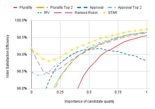
The voting method that jumps out the most here is Approval Voting; its VSE is relatively abysmal on the right side of the chart. (“Relatively” is an important qualifier here; its VSE is still within 1% of STAR’s.) But, from 0.25 to 0.4, Approval does the second best out of all the methods here. What’s going on is that, toward the right of the chart, the strategy for Approval Voting is badly miscalibrated. Approval’s VSE drops below Plurality’s because voters would be better off if they only voted for one candidate. As we discuss when we look into various strategies, the more the rest of the electorate agrees with your assessment of how good the candidates are, the fewer candidates you should vote for. But this chart uses the same strategy for Approval Voting regardless of the importance of candidate quality, so Approval Voting’s VSE is much lower than it would be with more reasonable voter behavior. The finding that Approval can underperform everything else with poor strategic behavior is interesting, but Approval’s poor performance should be attributed to a weakness of model rather than the voting method itself.
(My best guess is that Approval would do better than everything but STAR when candidate quality is very important if I tuned the strategy properly at each point. I’m not going to do that because it would be several hours of work for a single voting method in a single chart.)
Moving on to other methods, Ranked Robin and STAR perform about equally when candidate quality is unimportant. When candidate quality becomes somewhat important (at around 0.1–0.3 on the x-axis), both of these methods lose a little VSE. But Ranked Robin is affected substantially more than STAR, and underperforms everything expect Plurality and Approval Voting on the right of the chart.
I think what’s going on here is that having even a modest effect of candidate quality makes it more likely that the Condorcet winner is some dull centrist who few voters actually like. This is possible without making candidate quality important, but is more likely with it. Suppose you have three candidates in a line from left to right, with ~40% voters to the left of all the candidates and ~40% to the right of all the candidates, with the remaining voters smack dab in the middle. The candidate at the center is the Condorcet winner, and may still be the Condorcet winner even if he kind of sucks. But if he’s a low-quality candidate, most voters might prefer a 50–50 lottery between the more extreme candidates to electing the centrist, so electing the Condorcet winner yields poor VSE. Approval Voting’s strength at electing the utility-maximizing candidate when that isn’t the Condorcet winner explains its advantage over Ranked Robin in the 0.2–0.4 region.
It’s interesting to see that IRV and Plurality Top 2 slightly outperform Ranked Robin on the far right of the chart, but their advantage is minuscule (you have to squint to see it) because all voting methods perform so similarly here. The results are theoretically interesting, but for practical purposes, such small differences are nearly irrelevant.
Aside from Ranked Robin, the ordering of voting methods by VSE is about what we’re used to: STAR, Approval Top 2, Approval, IRV, Plurality Top 2, and then Plurality, well behind everything else. It’s interesting to see that Approval catches up to Approval Top 2 with enough importance on candidate quality, however.
Nonlinear preferences in issue-space
(This section is relatively math-heavy, so some readers may prefer to skip it.)
An implicit assumption in the models we’ve considered so far is that a voter’s opinion of a candidate varies linear with how far away from the voter the candidate is in issue-space. For concreteness, let’s consider two voters, one far-left and one far-right, and four candidates, one far-left, one center-left, one center-right, and one far-right. If both voters’ preferences are linear, this means that whatever advantage the center-right candidate has over the far-right candidate in the eyes of the far-left voter is perfectly counterbalanced by the advantage of the far-right candidate in the eyes of the far-right voter.
To allow for non-linear preferences with regard to a candidate’s distance from a voter, we construct a voter model as follows:
- We start with an underlying spatial voter model and get each voter’s utility for each candidate under the spatial model.
- We rescale each voter’s utilities to the interval [0,1], such that a voter’s least favorite candidate is assigned 0 utility and a voter’s favorite candidate is assigned 1 utility. (My reason for this rescaling is to prevent utility monsters from warping VSE.)
- We raise each voter’s utility for each candidate to some exponent. We call this the preference exponent, p.
In the example above, a linear utility function corresponds to a preference exponent of 1. If the preference exponent is less than 1, the left-wing voter cares more about the difference between the far-right and center-right candidates than the right-wing voter. This means that a candidate who maximizes VSE in an election containing only these two voters would be at the center of the political spectrum. If the preference exponent is greater than 1, the right-wing voter cares more about the difference between the far-right and center-right candidates. In this case, VSE is maximized by electing either the far-right or far-left candidate; the centrists aren’t deemed much better than the opposing extremists.
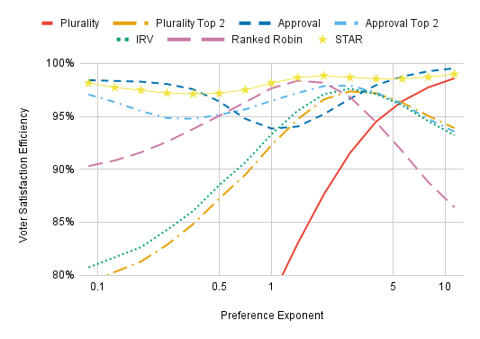
We can see the effects of preference exponents graphically:
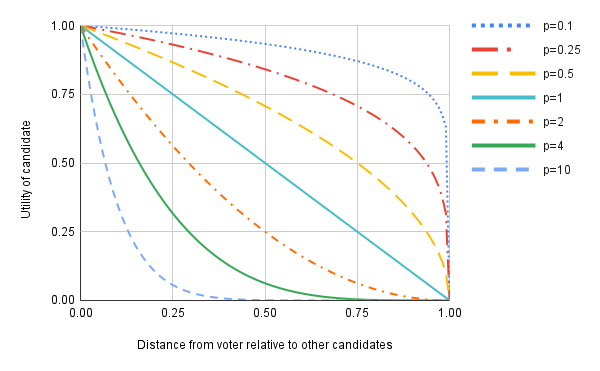
The x-axis is scaled such that a voter’s favorite candidate is always at 0 and a voter’s least favorite candidate is always at 1. Consider an arbitrary voter and a candidate whose distance from him is the average of the distances of the closest and furthest candidates from this voter — that is to say, the “distance from voter relative to other candidates” is 0.5. A preference exponent of p = 2 means the voter thinks this candidate is 1/4 as good as his favorite candidate (compared to his least-favorite candidate). A preference exponent of p = 4 means the voter thinks this candidate is 1/16 as good, and a preference exponent of p = 10 means the voter is essentially indifferent between this candidate and his last choice (more precisely, he thinks this candidate is 1/1024 as good). The higher the preference exponent, the less voters want to compromise. A preference exponent of p = 0.5 means the voter is compromise-happy and thinks that electing this candidate is about 70% as good as electing his first choice.
I think preference exponents less than one are more reasonable than preference exponents greater than one. If you think the optimal value for the highest marginal tax rate is 80%, presumably you have weighed the costs and benefits of a higher value and concluded that 80% is where they balance out. So you should view having a 60% marginal tax rate as being a much larger improvement over a 55% marginal tax rate than 80% is over 75%. Of course, it’s also easy to imagine voters having “my way or the highway” preferences that correspond to high preference exponents.
Now that we’ve discussed what different preference exponents mean, let’s see how they affect VSE.
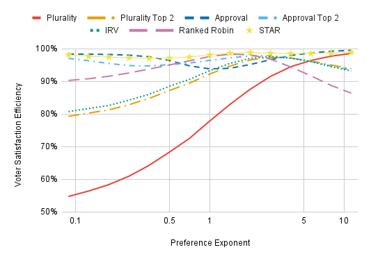
With a high enough preference exponent, the main thing voters care about is whether or not their favorite wins, so Plurality does well almost by definition. It outperforms the other ordinal methods we consider for p > 5 (an ordinal voting method is one that only looks at whether Candidate A is preferred to Candidate B and not at how strong this preference is). STAR and Approval still surpass Plurality, however; these methods allow “normal” voters who care almost exclusively about whether their first choice is elected to only support their favorite, while allowing “weird” voters who think the difference between their second choice and last choice is also significant to support additional candidates.
The results for voting methods other than Plurality are especially interesting. Toward the left of the chart, voters see the difference between their second-to-last choice and their last choice being much larger than the difference between their first and second choice. IRV and Plurality Top 2 do especially poorly here because differences between least preferred candidates have the least influence on the tabulation algorithm. IRV does a bit worse than Plurality Top 2 on the far right since it pays more attention to a voter’s later preferences than Plurality Top 2, and, with a high enough preference exponent, these later preferences are so weak that they’re usually just noise. This chart may be validating for those who think IRV yields better winners than either Plurality or Condorcet methods due to requiring both “broad support” and “core support”, provided they think the region 2.7 < p < 5 is the most relevant (see the solid green curve in the graph on preference exponents for what this looks like).
Ranked Robin does well with a preference exponent close to 1 but fares poorly at more extreme values. This is because Ranked Robin treats all pairwise preferences equally, even if voters hold some of them far more intensely than others. With a low preference exponent, voters want to have their preference for their second-to-last choice over their last choice to be the most influential, and with a high preference exponent, voters want to have their preference for their first choice over their second choice to be the most influential.
(This model likely underestimates Ranked Robin for high preference exponents since it does not account for the possibility that voters who are nearly indifferent between their later choices won’t bother ranking them. It’s still strategically advantageous to rank these later choices; the possibility we aren’t accounting for is that the laziness of individual voters can improve outcomes for society.)
It’s impossible for an ordinal voting method to do well everywhere on this chart. But cardinal methods can. STAR outperforms all the ordinal methods for all preference exponents. Approval does poorly for intermediate preference exponents but outperforms everything else at extreme values. What I think is going on is that Approval Voting is provably optimal under dichotomous preferences and voters’ preferences become closer to being truly dichotomous for higher preference exponents. At high preference exponents, voters mainly just care, “Is this candidate my favorite?” It’s analogous at low preference exponents. However, there are cases where two candidates are extremely similar to one another, such that vote-splitting is problematic even at high preference exponents. Approval Voting outperforms Plurality here, so it has a higher VSE.
At extreme preference exponents, adding a runoff to Approval Voting does more harm than good since it allows weak preferences to override strong preferences. STAR’s runoff is less problematic since voters with especially weak preferences will score the finalists equally and cast votes of no preference in the automatic runoff.
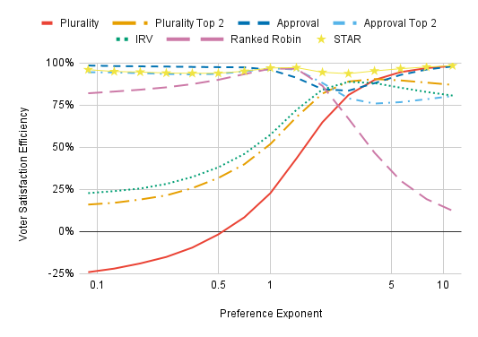
By the way, the effects of preference exponents are especially dramatic if we also reduce the candidate dispersion:
Effects of different strategies
Having analyzed the effects of different voter models, we now turn to the role of voter strategies.
Viability-aware strategic voting
When a lot of people go to the polls, they don’t just jot their opinions onto their ballots without thought of consequences — they vote strategically. We account for this by having some fraction of voters use viability-aware strategies that take both polls and their preferences into account. These strategies are designed to give voters as much of an advantage as possible while being psychologically realistic; I won’t describe them here, but you can find a complete description of them in my paper on Candidate Incentive Distributions.
(One note: I don’t have a viability-aware strategy for Ranked Robin. Broadly speaking, gaining an advantage through strategic voting under Condorcet methods is far more difficult than under any of the other voting methods we consider. It is still possible, of course, but it requires more sophisticated polling data than is used for other methods and would be considerably more difficult for me to implement in code and for voters to use. Ranked Robin is still included in the charts for the sake of comparison, but everyone votes sincerely.)

Just about every voting method benefits from strategic voting, and the voting methods with the lowest VSE tend to benefit the most.
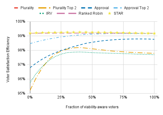

For Plurality Top 2, IRV, and (to a lesser extent) STAR Voting, having more than about 40% viability-aware voters will slightly reduce VSE. This is probably because these strategies are optimized for the case in which the vast majority of voters vote sincerely; I suspect that a more sophisticated approach to modeling strategy that let the strategic voters account for what fraction of the electorate votes strategically wouldn’t have this drop-off.
Viability-aware voting reduces the differences between voting methods, but it usually doesn’t cause one method to outperform another. The exception is Plurality Top 2, which surpasses IRV with enough viability-aware voters. This is because strategic voting is less likely to backfire under Plurality Top 2 since it always allows strategic voters to support their honest favorite in the runoff, which is not true of IRV’s instant runoff since IRV only has voters cast a single ballot.
I’ve used Expected Strategic Influence Factors (ESIF) to confirm that all of these viability-aware strategies outperform the sincere strategies. I may write a blog post on the more detailed results in the future.
Polling noise
Viability-aware strategies are more effective when they’re based on more precise polls.
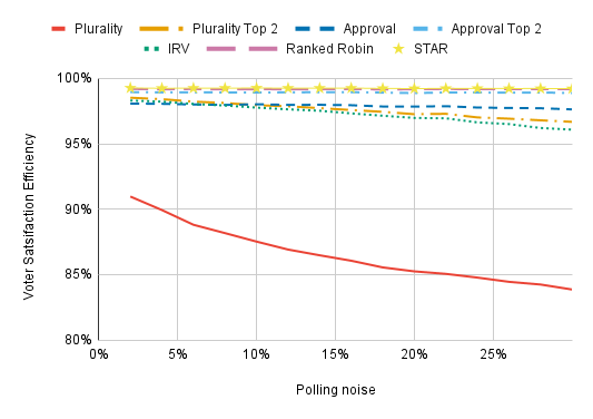
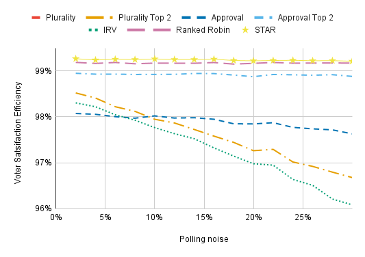
The x-axis shows the standard deviation of the (normally distributed) polling noise, which gets added to the actual support candidates receive to create the polls. The lowest value we consider is 2%, which might be plausible for a high-profile national contest but is otherwise unrealistic. High values are unrealistic when strategic voters are looking at actual scientific polling for a race, but are relevant if voters are judging whether city council candidates are viable based on the number of yard signs they see. Most of our charts assume 10% polling noise.
(By the way, voters factor in the amount of polling noise when casting viability-aware ballots. They’re more confident in their read on the election when polling noise is low.)
Polling noise has a substantial effect on the VSEs of Plurality, Plurality Top 2, and IRV, but it doesn’t affect other voting methods a great deal. With low polling noise, IRV and Plurality Top 2 appreciably outperform Approval Voting.
Sincere strategies for Approval and Approval Top 2
Unless otherwise stated, we model all voters as casting sincere ballots. For ranked methods, they rank all the candidates honestly. Choosing a sincere strategy is more complicated for cardinal methods (Approval, Approval Top 2, and STAR).
For Approval Voting, we consider strategies of the following form:
- Rescale your utilities such that the average candidate receives 0 utility and your favorite receives 1 utility.
- Vote for everyone whose utility is greater than some number z. We’ll call this the approval threshold.
Approval Top 2 is the same; voters are always best off voting sincerely in the runoff. We are left with two questions: First, what approval threshold is strategically optimal? Second, how does VSE depend on the approval threshold?
An approval threshold of 0 entails voting for every above-average candidate, which is the most commonly used assumption in simulation-based studies that include Approval Voting (such as Jameson’s first VSE simulations and this one that I’ve critiqued). However, in the appendix of my recent paper, I showed that a threshold of 0.4 is roughly strategically optimal for Approval and Approval Top 2. This is the value used for the sincere strategy in most of the charts. (Perhaps 0.5 is better for Approval and 0.35 is better for Approval Top 2; there’s a slight gap between what is optimal for each method. I opted to use the same strategy for each of them because that seemed like it would yield a clearer comparison.)
Why does it make sense to use an approval threshold greater than zero? A basic, but highly effective strategy under Approval Voting is to vote for every candidate whose victory would be better than how you expect the election to go. For example, if you think one candidate is strongly favored then you should vote for every candidate you like more and no candidates you like less. Unlike the previous section, the strategies we’re considering here won’t use any polling information, so there cannot be a candidate who is strongly favored to win. But you still have some information that suggests which candidates are more viable: your own preferences. If you’re a random voter and you like a particular candidate, this is evidence that other voters also like this candidate. It’s like a poll with a sample size of one: weak, but better than nothing. Candidates you love are more likely to win than candidates you hate, so you should be a bit pickier when deciding how many candidates to vote for than you would if you thought each candidate was equally likely to win. An approval threshold greater than zero captures this extra pickiness.
But, under some voter models, all candidates really are about equally likely to win. Under Impartial Culture, other voters’ preferences are uncorrelated with yours, so an approval threshold of zero is strategically optimal. Similarly, when candidate dispersion is low, voters with the opposite opinions of you will be roughly as common as voters who agree with you, and this again drives down the optimal approval threshold. And when candidate quality is important, other voters’ opinions of candidates will be much more strongly correlated with yours (this correlation is almost the definition of candidate quality), so the optimal threshold is significantly higher.
Voters may still use a higher or lower approval threshold than is strategically optimal. Here’s how it affects VSE:
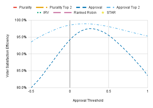
The socially optimal (i.e., VSE-maximizing) approval threshold is slightly lower than what is optimal for an individual voter, but this mismatch causes only a slight loss of VSE. A more worrisome possibility is that voters would use higher approval thresholds than is strategically optimal. A poor choice of approval thresholds doesn’t harm Approval Top 2 much, but it’s a much bigger deal with Approval Voting, where using an approval threshold of 0.6 instead of 0.5 reduces VSE by about 2%.
I have used an approval threshold of 0 on the chart for Impartial Culture and for all charts in which the candidate dispersion can be less than 1. An approval threshold of 0.4 is used elsewhere. Ideally I would have recalculated the strategically optimal approval threshold for every voter model, but that would have roughly doubled the work that went into this post. Just be aware that this approach probably resulted in a mild anti-Approval bias, and a not-so-mild bias for the candidate quality chart.
Sincere STAR Strategies
The sincere strategy for STAR works by rescaling the utilities a voter assigns to candidates as follows:
- The best candidate is assigned 5 utility.
- The average candidate is assigned 2.5 utility unless this would cause the worst candidate to be assigned more than 0 utility. In the latter case, the bottom of the scale is set such that the worst candidate is assigned 0 utility (so the average candidate is assigned less than 2.5 utility).
The score given to each candidate is the closest whole number to their utility.
(Settling on this strategy has involved a lot of trial and error. In my paper on STAR Voting with Jameson Quinn and Sara Wolk, the honest strategy we used for STAR Voting was less effective than the one used here. This resulted in lower VSE and made viability-aware strategic voting appear more effective than it would be with the new sincere strategy.)
In this section, we’ll look into what happens if voters don’t score candidates on a linear scale and are instead biased toward giving them lower or higher scores. We consider the following exponential strategy:
- Voters rescale their utilities to the interval [0, 1].
- Voters raise all their utilities to some number. We call this number the strategy exponent.
- Voters rescale their utilities to the interval [0, 5] (i.e., they multiply all of the exponentiated utilities by 5). Each candidate’s score is the closest interval to their rescaled utility.
Some concrete examples: Let’s suppose there are 12 candidates; the voter assigns the first candidate 11 utility, the second candidate 10 utility, and so on, assigning the final candidate 0 utility. Here are the ballots cast with some different values for the strategy exponent x.
- x = 0.7: 5 5 5 4 4 3 3 2 2 1 1 0
- x = 1: 5 5 4 4 3 3 2 2 1 1 0 0
- x = 2: 5 4 4 3 2 1 1 0 0 0 0 0
- x = 4: 5 4 2 1 0 0 0 0 0 0 0 0
- x = 8: 5 2 1 0 0 0 0 0 0 0 0 0
The exponential strategy is closely related to the exponential preference voter model we used earlier. In fact, for a given exponent above zero, both the exponential strategy (with our usual clustered spatial voter model) and the exponential voter model (with our usual sincere strategy) will often produce exactly the same ballots. The big difference is that, in this section, we aren’t altering voters’ underlying preferences — we’re just altering how they express their preferences. VSE judges voting methods according to voter preferences, so the results with the exponential strategy are judged according to the unexponentiated utilities.
First let’s ask: What exponents are voters incentivized to use, and how does it compare to the sincere strategy? We’ll answer these questions with Expected Strategic Influence Factors (ESIF). Roughly speaking, if a strategy has an ESIF of 110%, a voter using that strategy will have 110% as much influence as if she’d used the strategy that everyone else is using. ESIF simulations are very time-consuming with large numbers of voters, so we use only 51 here.
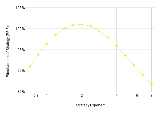
This chart shows that, if everybody is using the normal sincere strategy, voters are best off using a strategy exponent of around 2, and they get about 1% additional influence by using this strategy instead of the normal sincere strategy. (All of these strategies are sincere, of course. I’m just writing “the sincere strategy” to refer to what’s used in virtually all of the other charts.)
We can also look at the reverse scenario: If most people are using the exponential strategy, how effective is our normal sincere strategy?
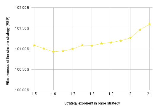
This shows that, if everyone is using the exponential strategy, voters are better off using the normal sincere strategy. The takeaway is that neither the sincere strategy nor the exponential strategy (with an exponent in the 1.5–2.0 range) is strictly better than the other; instead, voters have an incentive to behave differently from the rest of the electorate. If we wanted to we could look for an evolutionarily stable strategy by considering mixed strategies in which voters have some chance of using our normal sincere strategy and some chance of using an exponential strategy, but that would take us rather far afield from VSE.
Instead, we’ll leave off with the conclusions that our normal sincere strategy is about as close to being strategically optimal and that, within the context of the exponential strategy, strategy exponents from 1.5 to 2.0 are the most strongly incentivized. Now that we’ve established this, let’s see how the strategy exponent affects VSE:
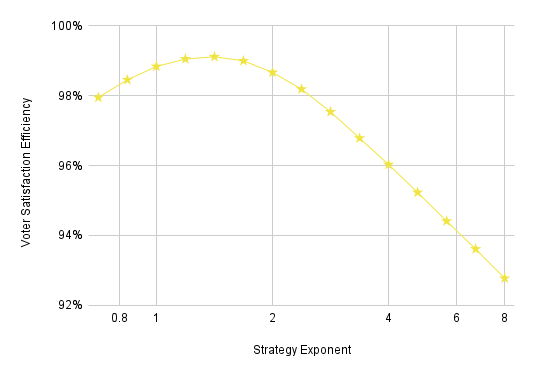
The socially optimal strategy exponent (~1.4) is very close to the lower end of the range of what may be optimal for the individual voter (around 1.5–2.0). VSE gets considerably worse towards the right of the graph, but high strategy exponents are strongly disincentivized and yield clearly extreme ballots. For example, a strategy exponent of 4 means you won’t distinguish between a slightly above-average candidate and the absolute worst candidate in the numerical example above.
Bullet voting
When given an expressive ballot, a lot of voters won’t want to use it to its potential. Instead, they’ll bullet vote: They’ll show the maximum amount of support to one candidate, and none to anyone else. In this section, we consider dogmatic bullet voting: always bullet voting for your favorite candidate regardless of your more nuanced opinions.
Bullet voting is sometimes a good strategy. If, under Approval Voting or Approval Top 2, you like one of the frontrunners much more than everyone else, it makes sense to bullet vote. Dogmatic bullet voting, however, is disincentivized under every voting method (excluding Plurality and Plurality Top 2, where the only way to cast a valid and non-blank ballot is to bullet vote). For the chart below, we randomly select some fraction of voters to dogmatically bullet vote and have everyone else use the sincere strategy. This is a little unrealistic since we should expect voters who think their second choice is almost as good as their first choice to be less likely to bullet vote under IRV, Ranked Robin, or STAR. Accounting for such tendencies would increase VSE in the presence of bullet voting.
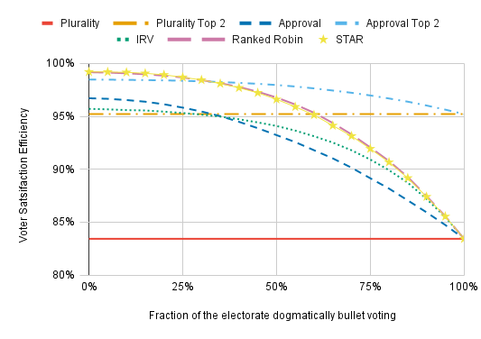
For Approval and Approval Top 2, the x-axis does not show what fraction of the electorate bullet votes; it shows what fraction of the electorate bullet votes dogmatically. There will be additional voters who bullet vote because it’s the best reflection of their preferences.
The methods that include a separate runoff perform the best with high numbers of dogmatic bullet voters because we model them as participating equally in the runoff. Voter turnout is often reduced in runoff elections, however, and this isn’t accounted for in these charts.
Having a small fraction of the electorate dogmatically bullet vote has only a small impact on VSE. Going from 0% to 25% dogmatic bullet voters reduces the VSE of every non-Plurality method far less than going from 25% to 50%. We also see that dogmatic bullet voting hurts IRV less than it hurts Approval Voting; IRV outperforms Approval with more than a third of voters dogmatically bullet voting (though Plurality Top 2 does better than both of them in this case).
We can also use this chart to ask what happens if dogmatic bullet voting is far more common under some methods than others. For instance, STAR and Ranked Robin outperform IRV even if half the electorate dogmatically bullet votes under the former methods and nobody bullet votes under IRV.
What fraction of voters should we expect to dogmatically bullet vote? FairVote finds that “A median of 68% of voters rank multiple candidates”, i.e., 32% bullet voting in the median election. We should probably focus on lower numbers, however, since bullet voting is less common in more competitive elections.
Other Results
Effects of limiting the number of allowed rankings
So far, we’ve assumed that voters will rank all the candidates under IRV and Ranked Robin (aside from dogmatic bullet voters). Many ballots don’t allow this:

Minneapolis only allows three rankings. New York City allows five. How do such limitations affect VSE? There’s an important difference between IRV and Ranked Robin: Ranked Robin allows voters to rank multiple candidates equally. IRV doesn’t (as is shown on the above ballot). To see how important this distinction is, we’ll look at Ranked Robin both with and without tied rankings.
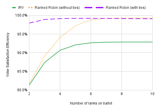
Allowing equal rankings makes a big difference. With tied rankings, Ranked Robin hardly loses any VSE from having three rankings on the ballot instead of letting voters give different ranks to all ten candidates. Without tied rankings, Ranked Robin’s VSE is below 90%. (One note: Having three ranks on the ballot means there are four different levels of support that a candidate can have, where the lowest comes from not ranking the candidate at all.)
However, this chart suggests that, in 10-candidate elections, limiting voters to five rankings (as New York City does) has little effect under IRV. I think what’s going on here is that lower rankings are unlikely to be relevant in the tabulation of IRV anyway, so preventing voters from expressing their later choices on their ballots makes little difference. It would be more significant under Ranked Robin if equal rankings weren’t allowed.
Results for other voting methods
We’ve focused on seven voting methods. Here we consider six more:
- Score Voting: Voters score the candidates on a 0–5 scale (just like STAR; we use the same sincere strategy for both methods). The candidate with the highest score wins.
- Borda Count: Voters rank the candidates; tied rankings are not allowed. In an n-candidate election, the candidate ranked the highest on a ballot gets n-1 points, the candidate ranked second gets n-2 points, and so on, with the candidate ranked last receiving 0 points. The candidate with the most points wins.
- Smith//Plurality, Smith//IRV, and Smith//Score: Find the smallest non-empty set of candidates such that each of them defeats each candidate outside the set head-to-head. This is called the Smith set. (If there is a Condorcet winner, the Condorcet winner will be the only member of the Smith set. If 1/3 of voters vote A>B>C>D, 1/3 vote B>C>A>D, and 1/3 vote C>A>B>D, the Smith set will consist of A, B, and C.) Then use the voting method listed second to select a winner from the Smith set, ignoring rankings or scores given to candidates outside it. Smith//Plurality and Smith//IRV use ranked ballots, and Smith//Score uses a score ballot with a 0–5 scale. For Smith//Plurality, each voter contributes one vote to their highest-ranked candidate within the Smith set.
- Minimax: Voters rank the candidates. The candidate whose greatest margin of defeat in head-to-head matchups against other candidates is the smallest wins. This is the Condorcet winner, if there is one.
We also include Ranked Robin again for the sake of comparison.
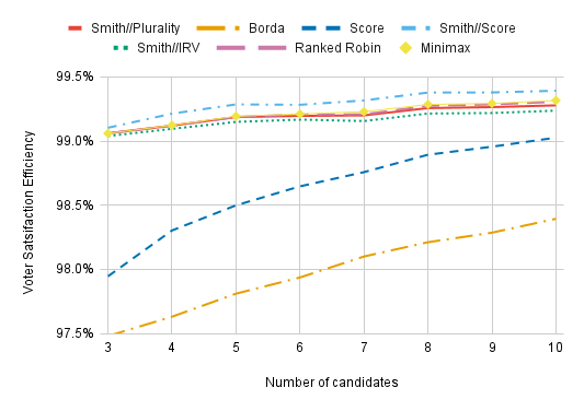
All of these voting methods outperform Plurality, Plurality Top 2, IRV, and Approval Voting so long as there are at least four candidates. The two non-Condorcet methods, Borda and Score, perform the worst out of these methods. Smith//Score performs the best, but there’s a caveat: In the other Condorcet methods, we model voters as giving unique ranks to all the candidates, but they’ll sometimes score two candidates equally under Smith//Score, even when there is enough room on the ballot to give distinct scores to all of them. This strategically suboptimal behavior may inflate Smith//Score’s VSE. We also assume suboptimal behavior for plain old Score Voting; voters would be best off giving every candidate a 0 or a 5 and voting Approval-style, but we don’t model that here.
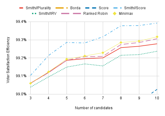
Zooming in, we see that Smith//IRV has the worst VSE of the Condorcet methods tested — worse even than Smith//Plurality’s. This is because IRV performs terribly when there’s a Condorcet cycle. Imagine a perfectly symmetric scenario in which 1,000 voters have the preferences A>B>C, 1,000 have the preferences B>C>A, and 1,000 have the preferences C>A>B. If we add in one A>B>C voter and 900 B>C>A voters, C will be eliminated. The 1,000 votes of the C>A>B voters will be transferred, electing A. Plurality, Borda Count, and Score don’t get confused by the presence of 3,000 voters with cyclical preferences that seem like they should cancel each other out. But IRV does. IRV removes the candidate with the least first-choice support from consideration, but beyond that, the winner is determined by the cycle.
However, all of these differences are tiny. All Condorcet methods yield almost the same VSE, and my takeaway from this is that, when choosing between various Condorcet methods, you shouldn’t base that choice on which of them has the highest VSE.
Let’s look at how Borda Count performs with viability-aware voters. (The viability-aware strategy for Borda count: Estimate each candidate’s chances of winning (call this p_i) and determine the expected utility of the election, E, which is the sum of each candidate’s utility times their probability of winning. Letting u_i be the utility assigned to each candidate, rank the candidates in decreasing order of p_i(u_i-E). If only two candidates have a meaningful chance of winning, this ensures that they will be ranked first and last.)
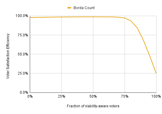
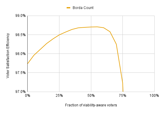
This shows that strategic voting can destroy Borda Count; with enough strategic voters, Borda does little better than electing people entirely at random. But the results are a lot better than I expected. If less than half the electorate votes strategically, strategic voting actually improves VSE. This is because, without strategic voting, Borda Count largely ignores many voter preferences. Suppose there’s a 5-candidate election and I think one candidate is great, another is mediocre, and the rest are bad. Only the great candidate and the mediocre candidate are viable. If I vote honestly, I only give one more point to the great candidate than to the mediocre candidate, but I help the great candidate four times as much if I vote strategically. Having one’s preferences be ignored usually harms VSE, and strategic voting prevents my preferences from being 3/4 ignored here.
If voters aren’t required to rank all the candidates, and all unranked candidates receive 0 points, Borda’s massive strategic vulnerability disappears. However, it still has the strategic issues of both Plurality and Approval Voting. Basically, you should rank only the candidates you’d vote for under Approval Voting, and your first choice should be the candidate you’d vote for under Plurality. If there are two viable candidates, the proper Borda strategy is to rank your preferred viable candidate first, even if there are non-viable candidates you like more. Failing to do this denies points to your preferred viable candidate and means you have less influence. You don’t lose as much influence as you would under Plurality, but it’s still a loss.
Effects of the number of voters
The number of voters has little effect on VSE so long as there are at least a hundred or so:
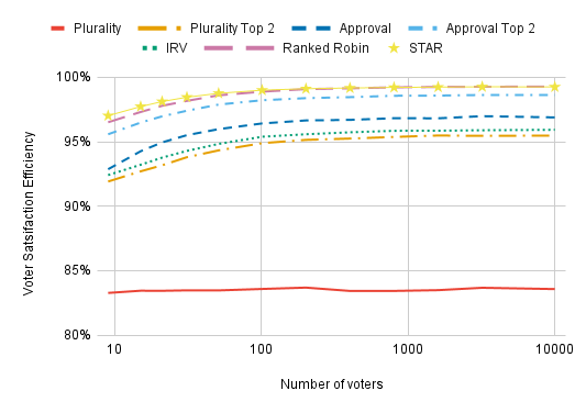
It doesn’t matter that we’re using 401 voters instead of 400,000; the VSE numbers are basically the same. Every voting method does slightly better with more voters, however (with the possible exception of Plurality).
Conclusions
It’s tempting to put all of these considerations together and create a final chart that incorporates everything from candidate quality to candidate dispersion to dogmatic bullet voting in its voter model and how it models strategic voting. I’ve resisted this temptation, however. The biggest reason is that I have a lot of uncertainty about the “correct” values for many important parameters; in many cases, I’d effectively be pulling numbers out of a hat, and this would provide a major opportunity for my preexisting biases to creep in. Another reason is that we should expect there to be different values in different circumstances; there could be a lot of importance on candidate quality in a school board race, low candidate dispersion in a gubernatorial contest, low preference exponents in a mayoral race but high preference exponents in a congressional race, etc.
We can embrace the uncertainty and ask, “How robust is each voting method’s performance under plausible modeling assumptions?” Broadly speaking, there are two considerations in assessing the importance of a given parameter (e.g., the importance of candidate quality or the amount of polling noise). First, how plausible is a given value other than the baseline value that’s used in most of the charts? (The baseline settings: 5 candidates, 1 for candidate dispersion, 0 for importance of candidate quality, linear voter preferences with respect to distance from candidates, i.e., a preference exponent of 0, everyone votes sincerely without dogmatic bullet voting, and voters rank all the candidates under IRV and Ranked Robin.) In general, I’ve erred on the side of including ridiculous values for parameters instead of excluding them in these charts, and some of these models are pretty absurd. Second, how differently do voting methods perform at this value? I’ll discuss what I view as the most important parameters to consider:
- Candidate dispersion: This is probably the most important of them all. While I think 20% candidate dispersion is implausible (I included the 20% candidate dispersion chart partly as an investigation into how low VSE could get and partly for the laughs), 50% candidate dispersion is plausible, and we should at least expect it to be below 90%. And lower candidate dispersion greatly increases the differences between voting methods. Going from 100% candidate dispersion to 80% (an entirely reasonable number, perhaps even a bit on the high side) reduces the VSE of IRV from 97% to 93%, Plurality Top 2 from 96% to 90%, and Plurality from 87% to 75%, while having a negligible effect on the other methods. The possibility of much lower values is also a weak-ish argument against STAR in favor of Condorcet or Approval Top 2, but candidate dispersion has to fall to 35% for STAR to lose even a full percentage point of VSE.
- Importance of candidate quality: I think it’s pretty obvious that realism demands a value greater than 0 here, though I have little idea how much higher it should be. The flip side is that the differences between voting methods dwindle at higher values, so the importance of this parameter seems only moderate. I think the possibility of a high importance of candidate quality is, first and foremost, an argument for assessing voting methods in ways other than VSE: All non-Plurality voting methods perform about the same when candidate quality is important, so we should be judging voting methods based on stuff other than who they elect. But I also see it as an argument for STAR over Ranked Robin; STAR gains about 0.3% in VSE relative to Ranked Robin when candidate quality is somewhat important. This amount seems small next to some of the other differences we’re looking at, but, since making candidate quality important mostly reduces the differences between voting methods, it’s substantial in this context.
- Non-linear voter preferences in issue-space: I think preference exponents close to 1 are the most plausible, but we should still care about the other values in both directions. These charts present a strong argument for cardinal voting methods over ordinal methods since ordinal methods cannot do well at all preference exponents, and having preference exponents far from 1 increases the differences in VSE. Plurality, Plurality Top 2, and IRV look especially weak to me here since they do worse with preference exponents less than 1, where the differences between voting methods are greater, and I consider preference exponents less than one more plausible than preference exponents greater than one. Shifting the preference exponent from 1 to 0.5 costs Plurality 10% VSE (more precisely, percentage points), Plurality Top 2 and IRV 5%, Ranked Robin 2.6%, and STAR a mere 1%. Approval gains two and a half percentage points.
- Viability-aware strategic voting: To a first approximation, this simply reduces the differences between voting methods. But it’s also a place where, under reasonable settings, IRV and Plurality Top 2 can slightly outperform Approval Voting. With 2% polling noise and 25% of voters casting viability-aware ballots, IRV and Plurality outperform Approval Voting by 0.2% and 0.4% VSE, respectively. The basic apples-to-apples comparison may be misleading, however, since we should probably expect more viability-aware voting under simple voting methods like Plurality and Approval than under more complicated methods like IRV. We should certainly expect some viability-aware voting, but it’s difficult to say how much.
- Dogmatic bullet voting: Bullet voting, even in cases where there’s no strategic incentive for it, is an empirical fact. We should definitely expect a value greater than 0. I think the 20% range is the most likely, where it has a minimal effect on VSE. But it could be higher, and that possibility presents the strongest VSE-related argument for Approval Top 2 over STAR and Ranked Robin. With 50% of voters dogmatically bullet voting, Approval Top 2 has a VSE of 98.0%, compared to 96.6% for STAR and 96.8% for Ranked Robin — not a huge difference, but still relevant. In this situation, Plurality Top 2 has a VSE of 95.2%, compared to 93.2% for Approval and 94.1% for IRV — again not a huge difference, but it’s another way that Plurality Top 2 and IRV can sometimes outperform Approval due to the effects of voter strategy.
- Different sincere strategies for STAR, Approval, and Approval Top 2: The difference in VSE between what is strategically optimal (in the absence of polling data) and our normal sincere strategy is relevant for Approval (up to about 1.2%) but minor for STAR (no more than 0.5% and probably much less). Suboptimal strategies can yield much lower VSE. Using an approval threshold of 0.6 instead of 0.4 costs Approval Voting 3.2% VSE, and increasing the approval threshold to 0.7 (which strikes me as being on the upper end of plausibility) costs an additional 2.2% VSE. I think STAR is similarly affected, though it’s impossible to make an apples-to-apples comparison; a strategy exponent of 4 (which seems on the upper edge of what is plausible to me, if not above what is plausible) yields a VSE of 96.0%, compared to 99.1% with the usual sincere strategy. Approval Top 2 is the least affected on account of having a separate runoff; an approval threshold of 0.7 yields a VSE of 97.0%, compared to 98.5% with the normal sincere strategy.
While one might be inclined to view such numbers as “corrections” to all the charts that use the sincere strategy that account for some voters failing to cast a strategically reasonable ballot, this can lead to apples-to-oranges comparisons. Approval, Approval Top 2, and STAR are the only methods where we’re bothering to model foolish voting patterns (aside from dogmatic bullet voting), but we should expect some amount of strategic incompetence under all voting methods. (For example, many voters only rank two or three candidates under IRV and end up having their ballots exhausted.) - Limited available rankings under IRV and Ranked Robin: This is a strong argument against IRV when there are only three available rankings; such a limitation reduces VSE from 92.9% to 87.4%. The effect is minor wth five allowed rankings (92.1% VSE). The possibility of equal rankings means that Ranked Robin is barely affected; it has a VSE of 98.9% with three allowed rankings, compared to 99.3% when there isn't a restriction.
On balance, STAR Voting appears the most robust to different modeling assumptions. We’ve looked at over thirty charts, and STAR’s VSE never dips below Plurality’s or IRV’s, even momentarily. This doesn’t mean STAR is clearly the best voting method, even if we’re judging solely based on VSE. Ranked Robin and Approval Top 2 both outperform STAR in plausible settings, even though STAR usually beats Approval Top 2 and handles nonlinear voter preferences far better than Ranked Robin. These three methods seem to be top-tier; there are places where others do better, but other methods have worse baseline performance (that is, in the clustered spatial model without added stuff like candidate dispersion) and usually have major vulnerabilities.
Approval nearly always underperforms STAR, Ranked Robin, and Approval Top 2; the exceptions are voter models which frequently cause the utility-maximizing winner and the Condorcet winner to differ. Approval’s biggest vulnerability comes from the potential for poor voter strategy, which can easily cost it around 3% VSE. But this is a mild weakness when compared to those of IRV and Plurality. Approval does extraordinarily well under a few of the stranger voter models (most notably with preference exponents that are very far from 1 in either direction), but it typically performs in the middle of the pack and doesn’t have big weaknesses.
IRV and Plurality Top 2 perform on about the same level as Approval Voting for the most part, they do slightly worse in most charts, but handle bullet voting a little better and benefit more from small amounts of well-informed strategic voting. But IRV and Plurality have gigantic weaknesses. Both perform abysmally when the candidate dispersion is less than one; they can easily get less than 80% VSE, and they can even go below 50% VSE with vaguely plausible settings (50% candidate dispersion and over ten candidates). They also perform very badly with preference exponents less than one. Plurality Top 2 can slightly outperform IRV when strategic considerations like bullet voting are taken into account, but it does appreciably worse than IRV in most charts, and its vulnerabilities are more pronounced.
Out of all the methods we’ve considered, Plurality stands out the most. It’s consistently worse than all other methods in the vast majority of charts. Usually, the gap between Plurality and the worst method other than Plurality (which is usually Plurality Top 2) is larger than the gap between the worst non-Plurality method and the best method. And on top of its consistently bad performance, Plurality has the most extreme vulnerabilities of any voting method we’ve considered. In ten-candidate elections with 50% candidate dispersion, Plurality’s VSE is negative.
Voter Satisfaction Efficiency is not the one metric that matters. There is far more to voting methods than selecting good winners, and VSE tells us nothing directly about other desiderata such as simplicity, strategic straightforwardness, third-party visibility, or incentives for depolarization. Such other considerations are especially important when debating between top-tier methods that do comparably well in terms of VSE. “STAR typically gets higher VSE than Ranked Robin and Approval Top 2” is a less important takeaway than “All three of these methods perform about equally well”. But looking at VSE under many different models tells us where voting methods do well and where they struggle. It suggests directions for future research — for instance, more studies on candidate dispersion would tell us a lot about the relevance of one of IRV’s weaknesses. And, of course, selecting good winners is important. It’s the most obvious quality to look for in a voting method, and VSE is an excellent means of quantifying it.
If you want to learn more about voting methods, check out How to learn about voting methods for a lot of useful links.
Thanks to Kellyn Standley for editing this post.